17 October 2023
To get involved in the development conversations, follow our Instagram page!
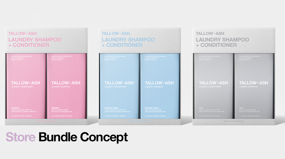
What do you think of these bundle concepts for in store?
Last month we asked you guys what shops you’d like to see Tallow + Ash in, and we’ve got a new survey coming tomorrow for all T+A customers so we can find out even more about you!
In one of our first ever surveys, over 80% of you said you grab your laundry products in supermarkets with your weekly shop! We want to make it as easy as possible for you to top up on your favourites in the future, so we’re working to make that happen for you!
Whether it’s online, or in stores, we want to make sure you have the best experience with Tallow + Ash. All of our fragrances come in both Laundry Shampoo + Conditioner, and using them together gives the best results, so we’d love to bring the experience of buying them as a pair into stores!
Let us know what you think of this bundle packaging! And thanks in advance to everyone who takes part in the survey tomorrow. You guys are at the heart of everything we do, so your feedback is so important to the people here!


34 comentarios
Nyree McAleer
The white background, with the coloured print co-ordinating the packaging, gives a coherent look. There is also something elegant about them being ‘same, but different’.
The fully coloured backgrounds make them look like completely different products.
Louise Oneal
Great idea love them all
Harry
I like the concept of the box matching the colour of the products. I think that you should also keep them as multipacks so the shampoo and conditioner together in a pack as if they was single packs I’m not sure as to wether pricing may change?
I also like the idea of a scratch and sniff sticker on the packets as without a doubt I’m sure someone will attempt to open the packet and ruin it just to smell it.
Chris
The concept is great but from a branding perspective, keep ‘Tallow + Ash’ in a constant colour (dark grey?) across all product lines, then use the product colour in the product description. The light grey/silver background is the more prominent of this selection
Ness d
I’m an anthropologist, and digital scientist. My first thing to say is that you need to consult WCAG.20 standard and inclusive design standard for design and content standards. Make it readable for the few, not the many!
Dejar un comentario
Este sitio está protegido por hCaptcha y se aplican la Política de privacidad de hCaptcha y los Términos del servicio.